Advertisement

Fresh branding highlights Quinn’s commitment to transparency

New branding highlights Quinn’s commitment to transparency
GRAPHIC COLLAGE BY AVANT FOOD MEDIA | SOURCE IMAGE FROM QUINN
BY: Lily Cota

Lily Cota

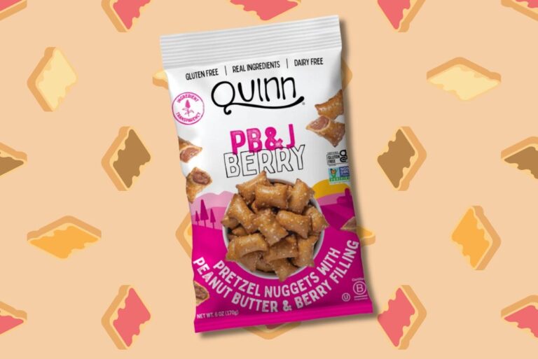
BOULDER, CO — Quinn, a natural foods company reimagining classic snacks, debuted a new packaging design that reflects the brand’s evolution and showcases its commitment to ingredient integrity and enacting change in the food system.

“Quinn hits different, and the packaging had to match the energy,” said Kristy Lewis, Quinn’s founder and chief visionary officer. “The packaging got a vibe check: fun, intentional and straight-up honest about who we are.”

The refresh — featuring vibrant colors, simplified messaging and a fresh visual identity — was designed to communicate the nutrition behind Quinn’s products. With ingredient callouts and clear visual ties that highlight the brand’s use of regeneratively grown ingredients, Quinn’s rebrand provides what modern consumers are increasingly searching for: transparency. This mission aligns with Quinn’s B Corp Certification, which was administered to the brand at the tail end of 2023.

Advertisement

“This refresh is more than a new look — it’s our mission front and center,” said Beth Hunsicker Parker, VP of marketing at Quinn. “We know our fans care deeply about what’s in their food and how it’s made. So, we refreshed our design to bring it all to the surface — purposeful ingredients, real-food nourishment and the bold, craveable flavor that keeps people coming back.”

Product attributes such as non-GMO, gluten-, dairy-, corn- and soy-free, as well as the use of regeneratively grown brown rice flour, are clearly depicted on the front of the new packaging.

Quinn’s refreshed packaging is rolling out nationwide online and in-store.

Advertisement

Advertisement

Related News

Advertisement

Advertisement

Advertisement

Advertisement

Popular Articles