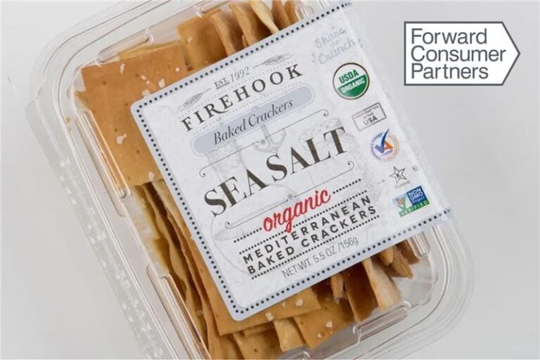


CHANTILLY, VA — Artisan cracker brand Firehook is undergoing a vibrant rebrand, featuring changes to its packaging, logo and overall design.
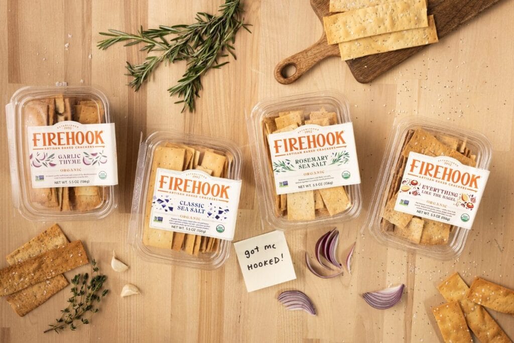
Led by branding and design firm Stranger & Stranger, the rebrand unites Firehook’s past with its future, paying homage to its existing identity while setting sights on what’s to come. The refreshed orange logo uses a more modern typeface and incorporates a stylized fire hook, inspired by the iron tools used by the earliest bakers to retrieve goods from stone ovens.
“Our goal was to reimagine Firehook Crackers’ artisanal look, infusing it with boldness, modern energy and a spark of liveliness, all while honoring the soul of their handcrafted roots,” said Cosimo Surace, group creative director at Stranger & Stranger. “The result is a truly fresh identity that feels as vibrant as it is true to its craft.”
The updated packaging features the brand’s name front and center, accompanied by hand-illustrated graphics that honor the simplicity and flavor of the premium ingredients found in each cracker.
“Consumers know us for our quality ingredients and craveable crunch, but our name might be one of the best-kept secrets in crackers,” said Ellen Howse, chief marketing officer of Firehook. “We are excited to introduce the new Firehook look to consumers with a renewed focus on visual appeal and imagery that celebrate the craft, flavor and heritage behind every cracker.”
Firehook’s new branding will hit store shelves nationwide alongside a new website, social content, and updated shelf and display merchandising.